ETA: Thanks for all the comments, I chose the top right pic which seems to be the most favorite.. and I agree with all your comments 😀 I sent a copy of the pattern to kristen.


I booked a slot for a featured Crochet pattern on Ravelry next month, and am trying to come up with a graphic. It’s hard to make decisions though and I’d love to hear which one you think is most attractive / has the most visual impact.


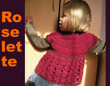
Which picture do you prefer / showcases the Roselette pattern best ? Should I keep it short with “Roselette” or the full “Roselette top” ? Color or no color, layout style… Of course I came up with tons of variations of those. Really I’d LOVE to hear what you think ! 😛
I already asked my husband (he’s a web developper and does some graphic work) and he came up with the top right one. Better ? (he always kinda laughs at my design pursuits… but in a nice way)
I’ll send a copy of the Roselette pattern to the most helpful comment ! 😛
Nice pattern! I would go with a photo that shows the multiple sizes – first of all, adult patterns are more popular than kids’ patterns generally; secondly, it looks great in all three versions so you want to get the most bang from your Ravelry buck; and third, the kid with the bunny is hilarious.
Of the two versions that feature multiple sizes, I prefer the bottom left version – I’m not a fan of the shading in the upper right version.
Hope that helps! (And I wish I could crochet!)
Well you know I am already a fan, so I don’t need another copy of the pattern… but I really like the top right one. I think it’s a cute picture, and I think you should go with Roselette instead of Roselette top. Good luck! I hope the featured pattern thing gets you lots of sales!
I looked at them all and thought “I’ll choose the one that my eyes stay on the longest”…………… that one was the top right. I also like lower left but top right gets my vote. Very exciting to shine on Ravelry——— yay!
Yep, top right one, and nope, I already have the pattern!
Top right one definitely.
Reasons:
– shows all sizes
– shows adorable kids
– shows adorable kid holding a rabbit (can’t lose)
– shading effect is a v modern graphic style
– top left, text is too hard to read
– bottom right, shows only 1 size, and don’t need the word ‘Top’
Well done, it’s lovely.
I like the one in the lower left corner. It’s clear and eye-catching. The best part is that it shows the different sizes available (a big plus). I do love the shot of the little one alone, but that’s a personal thing. Kids are great models. Still, I would go with the lower left one. It’s an adorable top.